In Lieu Of Anything Important:
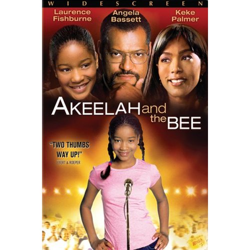
Right then. Anyone else see something wrong with this picture? No?
Personally, I was unaware that Laurence Fishburne was a 12 year old girl. Or that Angela Bassett had started sporting a goatee. And Keke Palmer should think about changing make-up stylists if she's looking three times or more her own age. (Of course, that could be the 'in' thing nowadays... Kids.)
Just how hard is it to put a person's name over their face on a poster? I know I didn't major in Graphic Design at college, but that seems like something kind of important, not to mention fairly easy to align: It's text. Over a picture.
I mean, the movie in question is promoting literacy and good spelling, for cryin' out loud. Way to stick to the theme.
As to why this irks me so, it can't be a complete mystery-- I'm an actor, I'd be somewhat ticked if I saw a poster with someone else's name over my face, or vice versa. Now granted, if it was just one person's noggin on the poster with more than one name overhead, that'd be different. I'm aware that spacing, aesthetic and prominence all play a part in advertising in print.
But to have one, two, three faces in a row at the top with one, two, three names hanging over them; and not a one is where it belongs? Someone looks pretty darn stupid. Namely, whoever put the images together... or yours truly for spending 254 words pointing it out. Take your pick.
posted by Casey Jones @ 9/06/2006 09:12:00 AM
![]()


1 Comments:
At 10:29 AM, mr.stinkhead said…
I was going to point out that it's a billing thing. Like Mr. Fishburne's agent DEMANDED his name go first on the poster. Come hell or highwater. Or an unfavorable layout.
There was another one that killed me... lemme think
ok, it's not this one that was *really* bad, but this one is kind of bad. I'm at work, I can't do too much research right now
Click
Post a Comment
<< Home